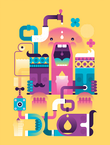
Fernando instantly creates a joyful, positive atmosphere by the bright colours which take over the design and are the first thing you notice on the image, therefore you look at the designs with a positive attitude.
I think Fernando has used the space well in this design as the shape of the objects stands out more because it has been placed in the middle of the box. Fernando has used a range of colours and in this design there are lots of ways you can look at it and always see new things, therefore I think that resembles love as love has lots of different sides and you are always finding learning new things.
This design includes lettering of the word ‘SUMMER’ this automatically creates a happy mood and you associate this season with bright colours and having a good time, therefore this design resembles all those things well that many people love. I like how Fernando uses a lot of objects and puts them all together as a collage, as it feels like a summary of all the things you love in summer. Once again Fernando has used the space well, by placing all the objects in the middle which creates an interesting outline of all the objects forms together.


